Frame

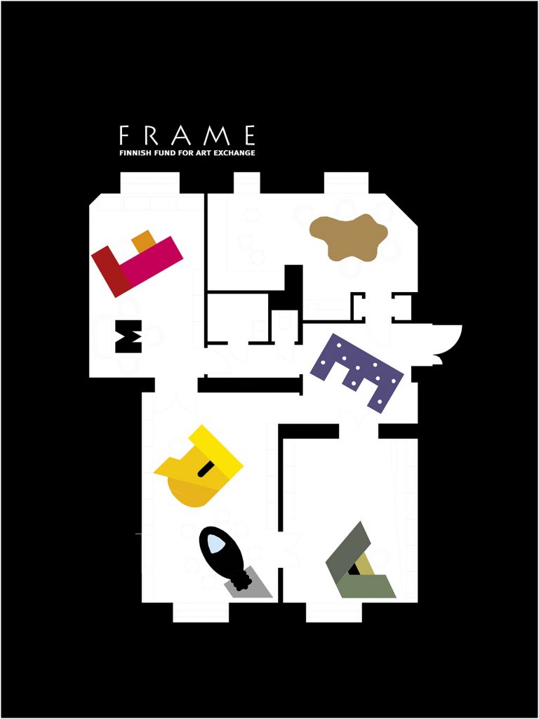
The idea for the design is based on the word FRAME. The letters F, R, A, M were turned into different coloured desks. The red F is based on the colour of the lipstick of the director at the time, Marketta Haila (Seppälä).
The green A is the favourite colour of the curator Paula Toppila. The R was made yellow just to cheer up the space! M is a small table for meetings in the director’s room. E was made into a lamp in the lobby. All of the shelves are made of unpainted brown MDF sheets. The table for showing slides was made in the shape of a light bulb, and in the kitchen, a kitschy Finnish lamp from the 1970’s shines over the organically shaped table, where curators and museum folk meet to discuss Finnish ar t.
Design for the new office for FRAME, Finnish Fund for Ar t
Exchange, an organisation that promotes the visibility of Finnish visual ar ts internationally, 2000.

